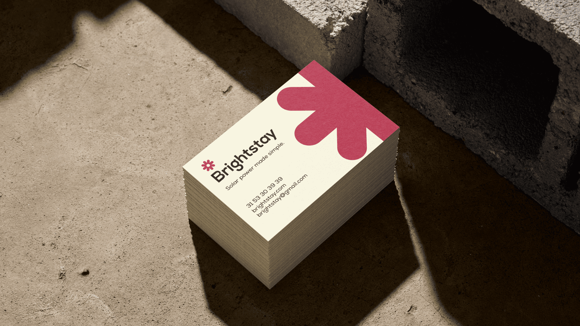
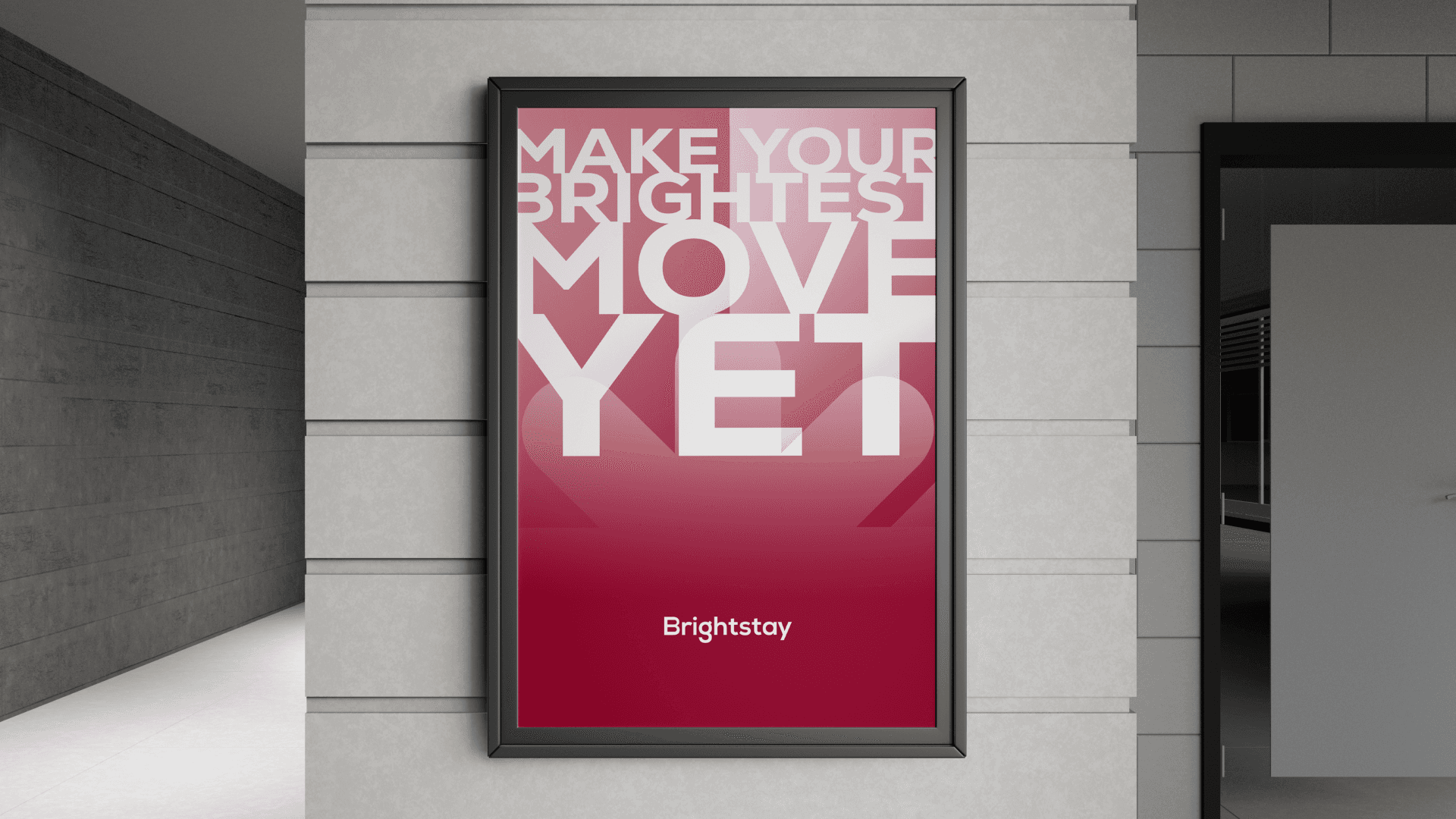
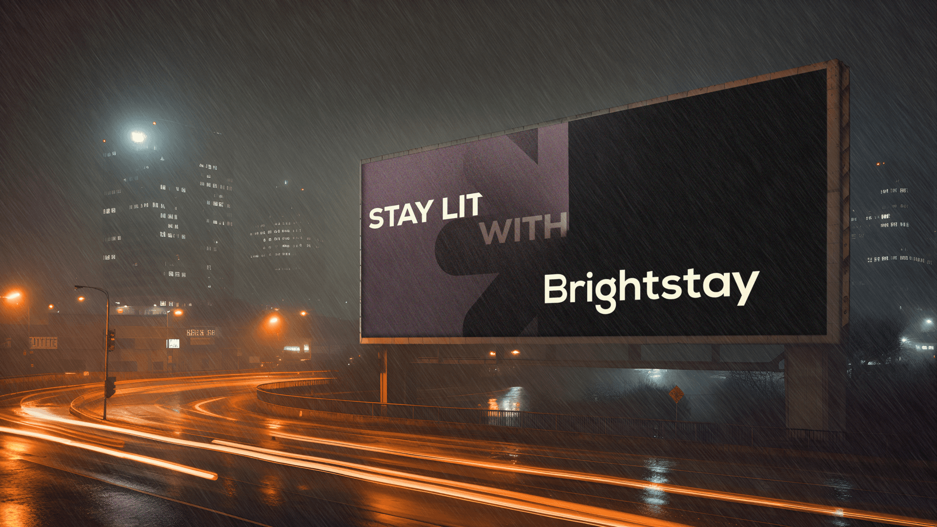
Brightstay | Brand Guidelines
I see this brand as a beacon of innovation and accessibility in the housing market. The combination of glamour and practicality in our brand messaging will resonate with our target audience, making sustainable living not just a choice, but a desirable lifestyle.
Our visual identity will reflect this balance, using modern, sleek design elements that convey both luxury and affordability.
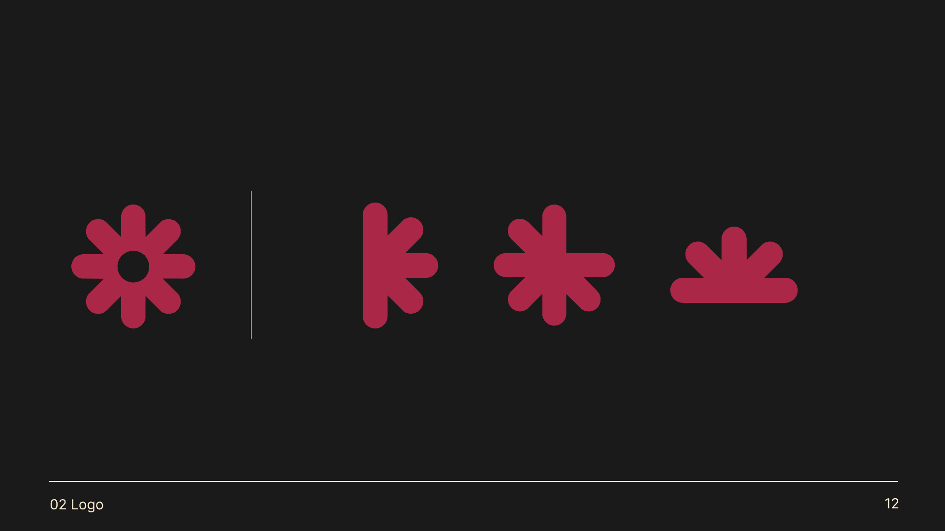
The Brightstay logo presents a vibrant and dynamic visual identity that aligns perfectly with our brand values and target audience. The logomark, a stylized sun, serves as a powerful symbol of renewable energy and optimism, capturing the essence of our mission to provide affordable, solar-powered homes.
The sun, as our logomark, is designed to be highly versatile and dynamic. This flexibility ensures that it can be effectively utilised across various media, from digital platforms to print materials.

Zeno | Branding Identity

Flyward | Branding Identity

Broadway NY | Visual Identity

Coexist | Brand Identity and Guidelines
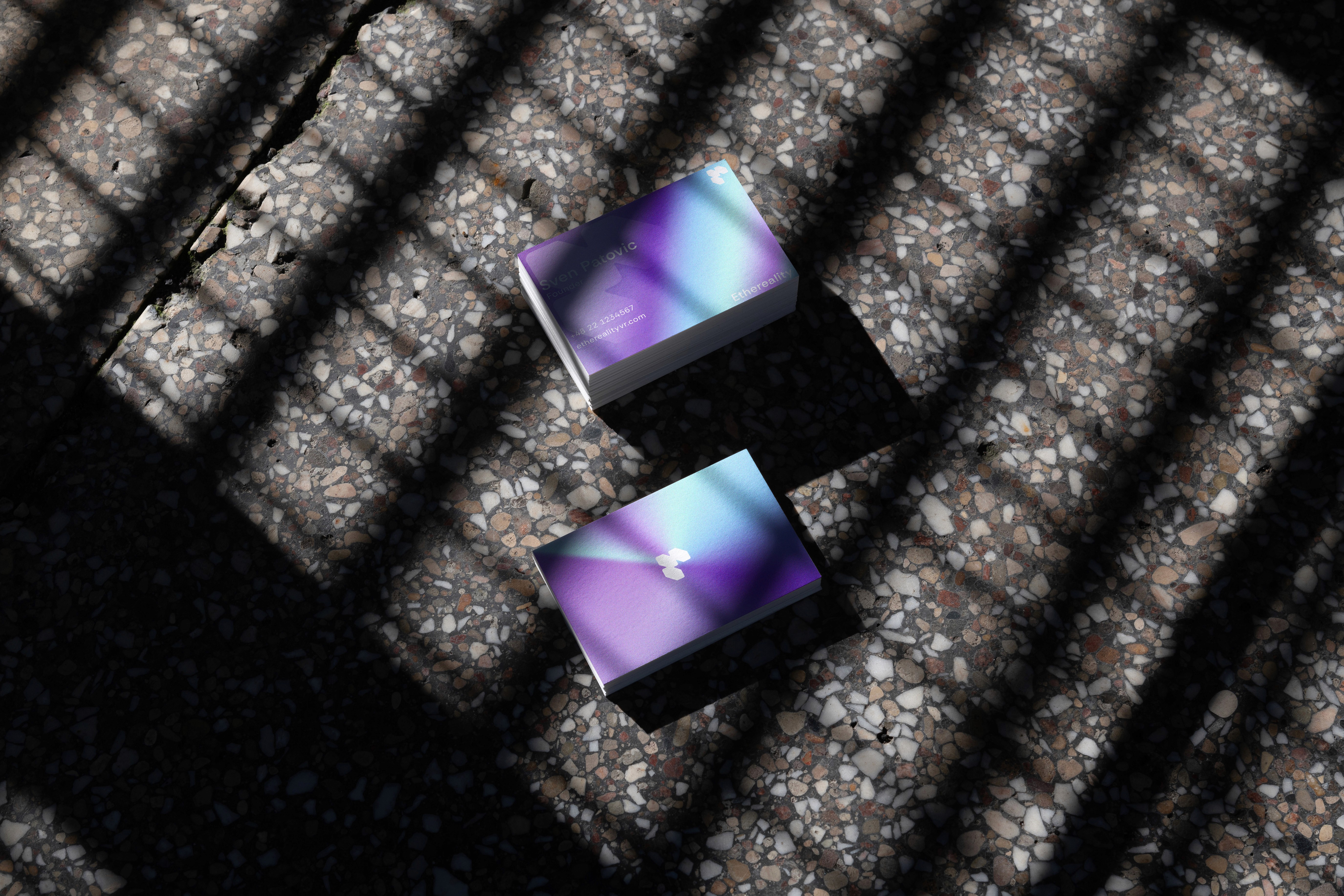
Ethereality | Brand Identity
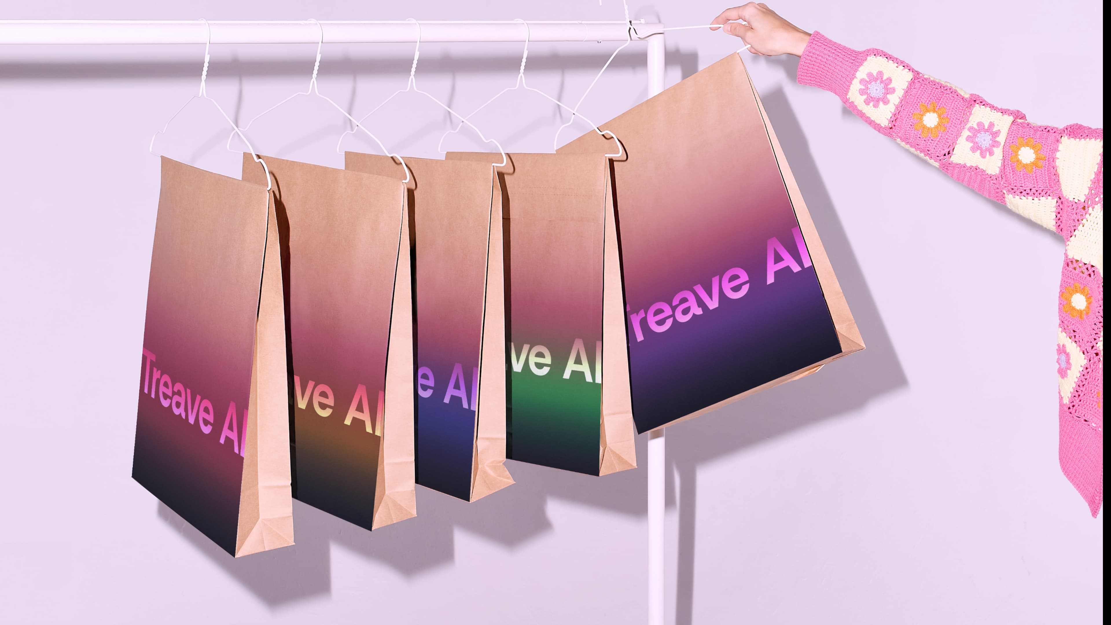
Treave AI | Brand Identity
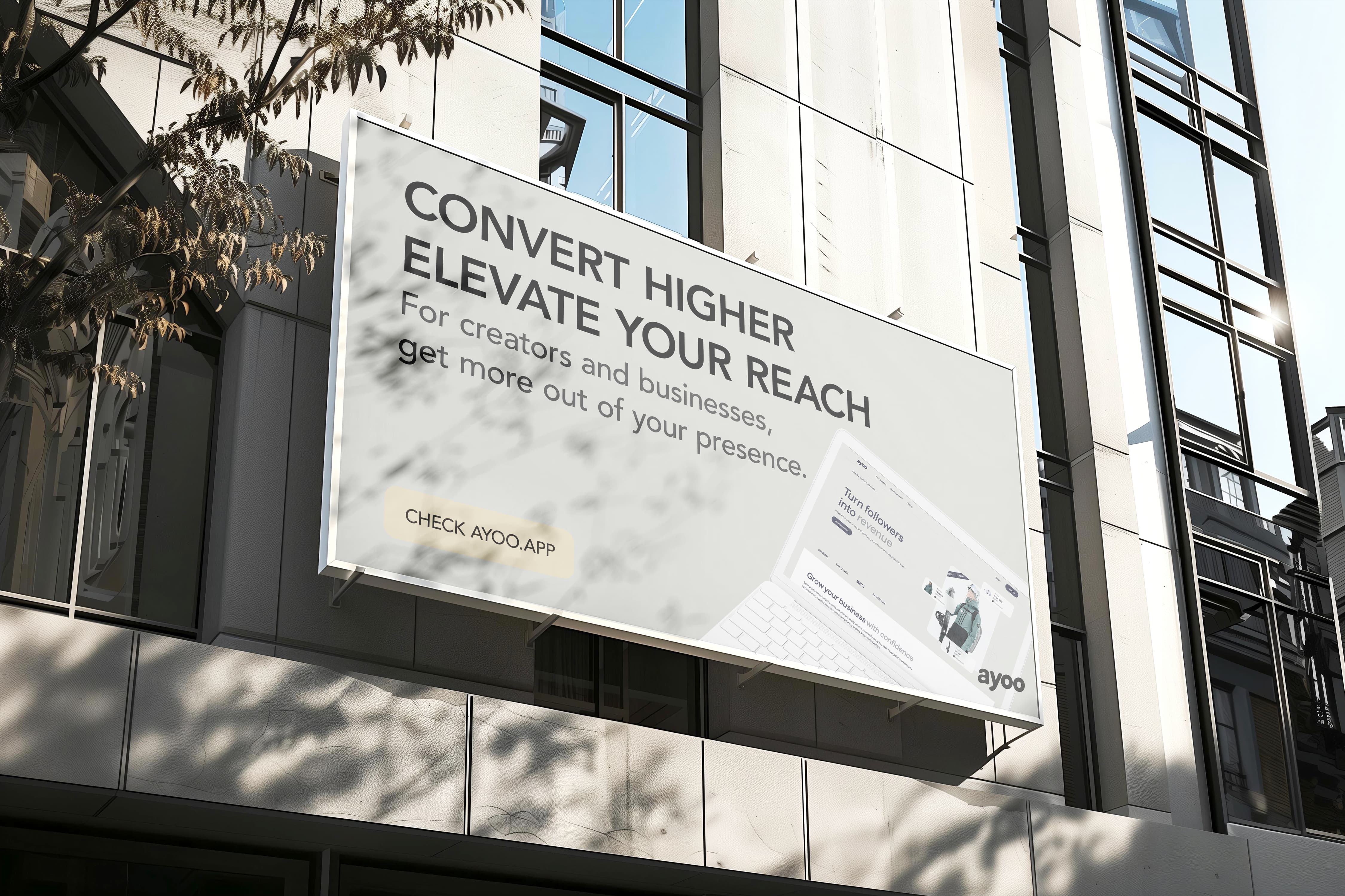
Ayoo | Brand Identity and Guidelines
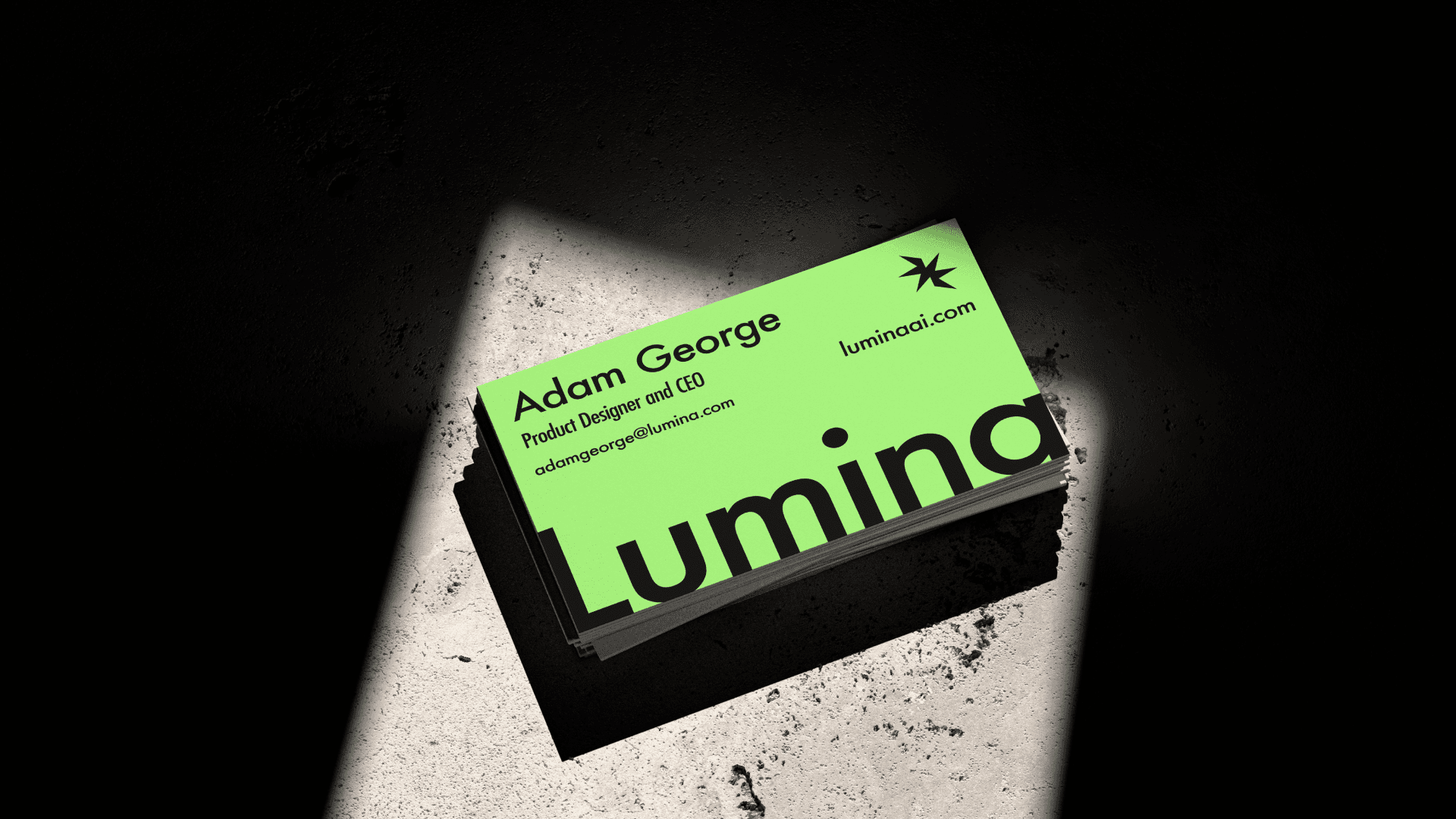
Lumina | Brand Identity
Aeon Logo Design
