Optical Visions | Brand Guidelines
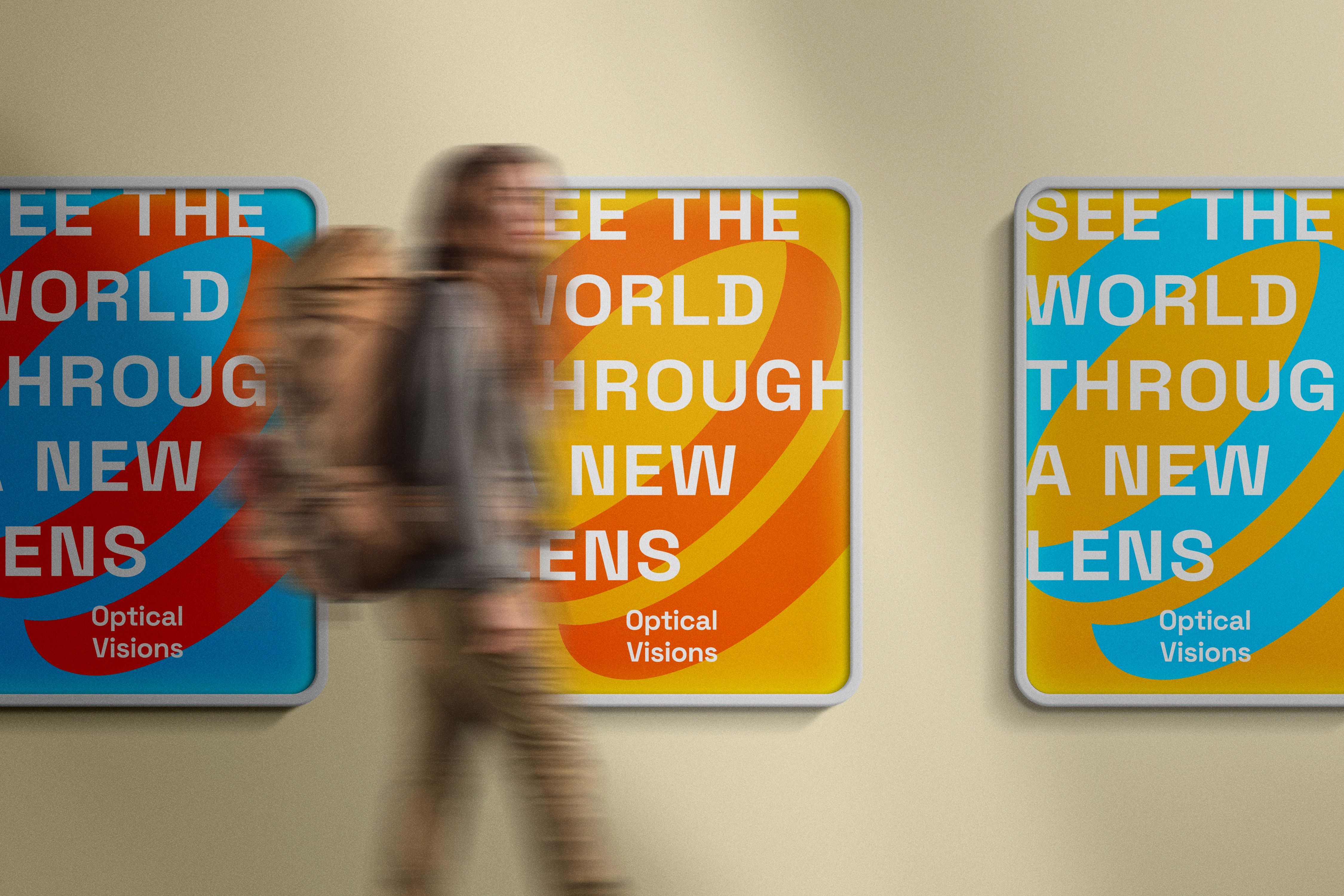
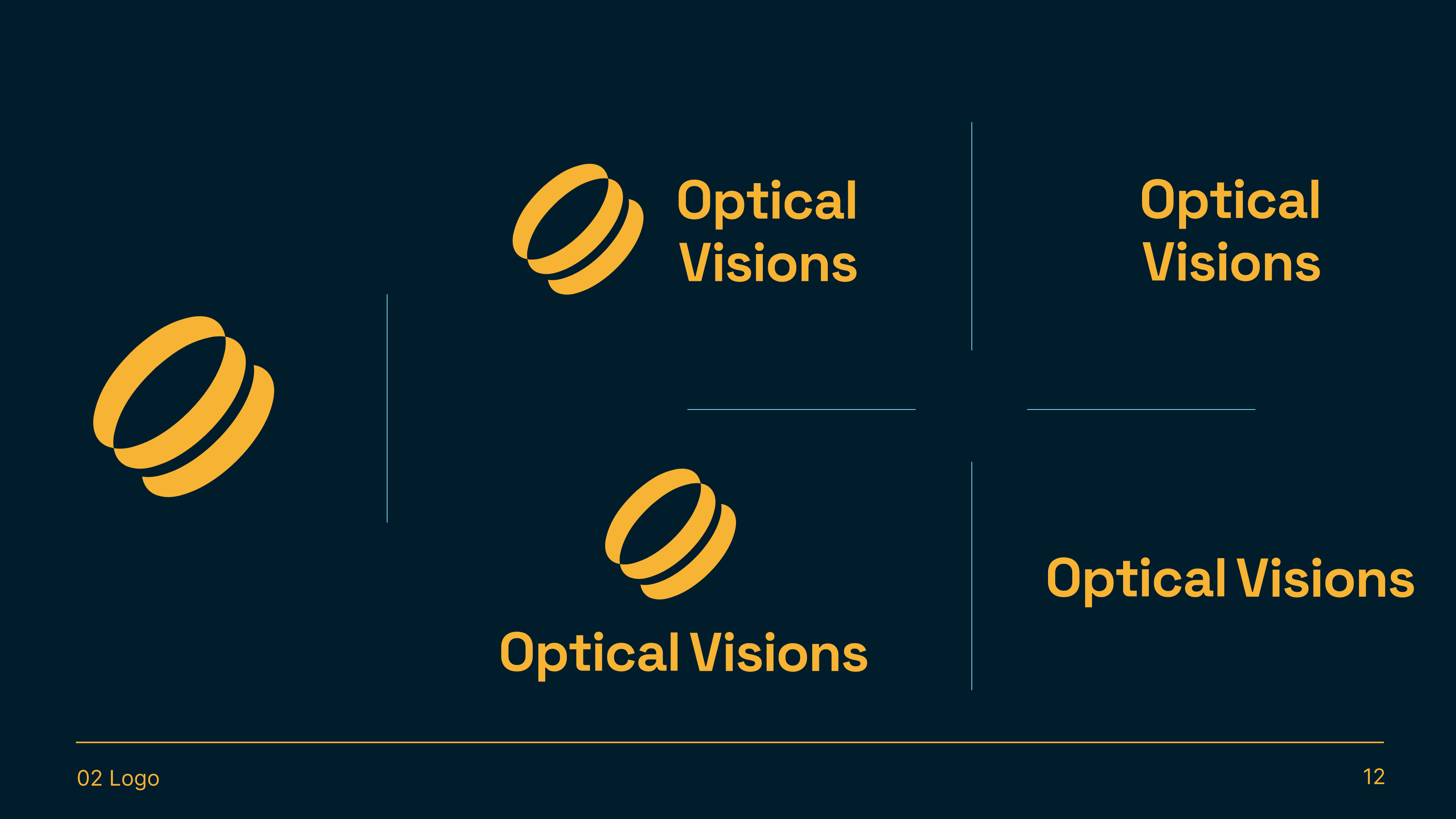
As a professional graphic designer, I have made a brand identity for Optical Vision that reflects its core values and mission. The logo, with its sleek, modern design, symbolizes the clarity and precision that our products offer. The gradient background represents the wide spectrum of opportunities and creativity that our equipment opens up for users.
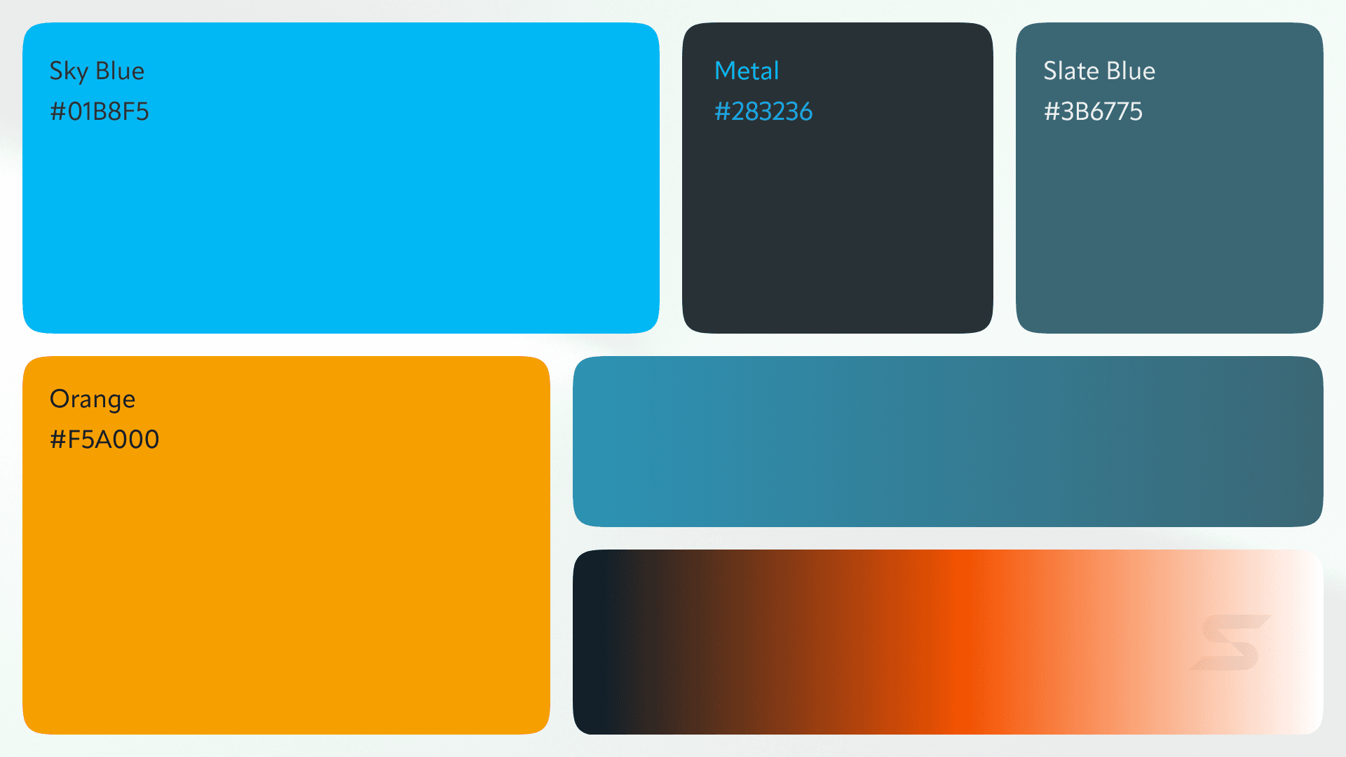
The interlocking circles in the logo represent the lenses and the focus that is central to photography. They also symbolize inclusivity and connection, reflecting our commitment to building a community. The abstract nature of the logo gives it a modern and sleek appearance, appealing to contemporary tastes and emphasizing our focus on cutting-edge technology. The transition from blue to orange signifies the journey from beginner to expert, highlighting the educational aspect of our mission. Blue evokes trust and professionalism, while orange conveys creativity and enthusiasm.

Flyward | Branding Identity

Broadway NY | Visual Identity

Coexist | Brand Identity and Guidelines

Ethereality | Brand Identity

Treave AI | Brand Identity

Ayoo | Brand Identity and Guidelines

Lumina | Brand Identity
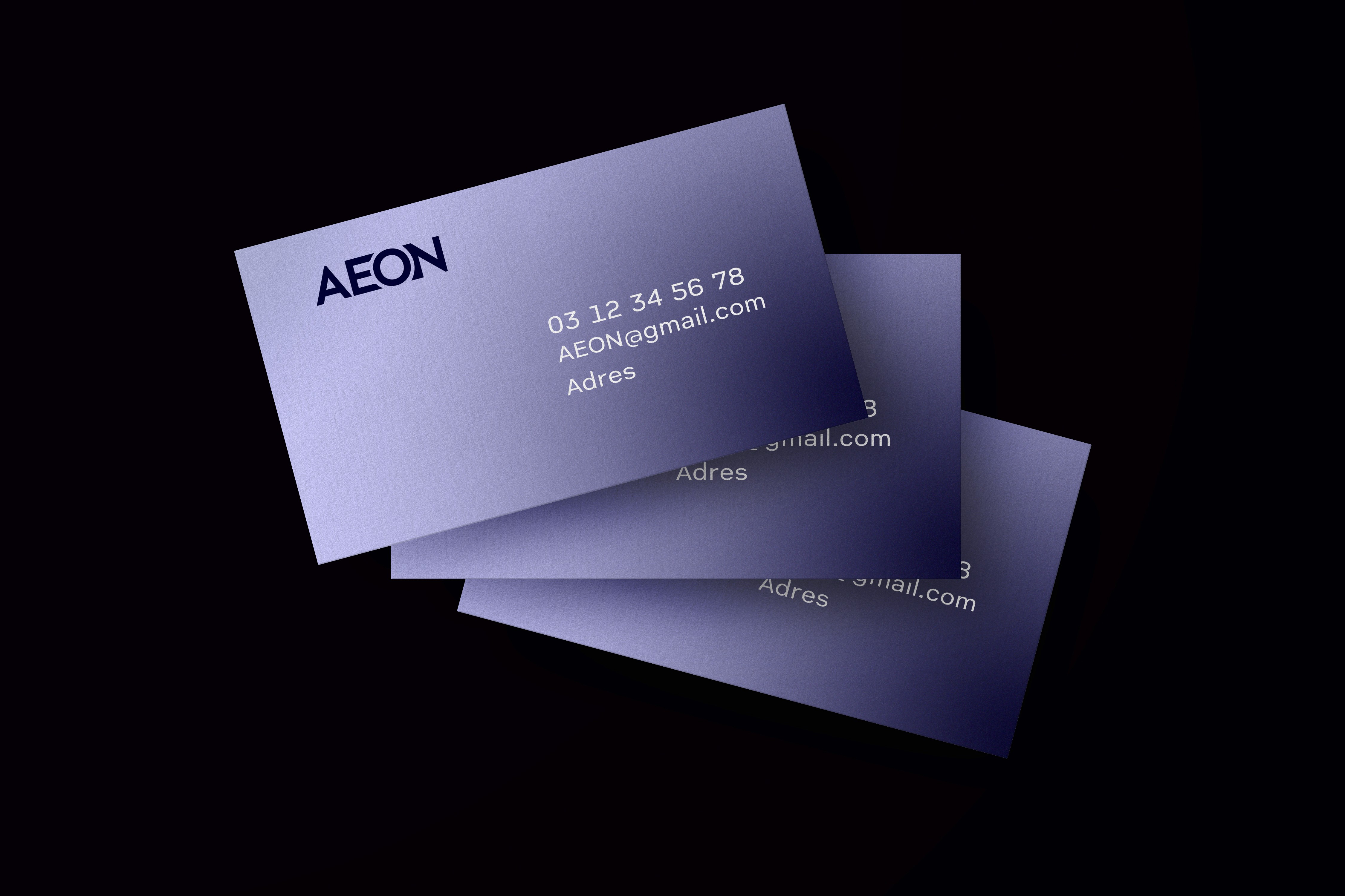
Aeon Logo Design

Serenity | Brand Guidelines & Identity
